
How One Ugly Page Saved $165K
Designing with an outdated design system is never the most exciting thing, but as designers we often have to learn how to make the biggest impact with what we’ve got.
Designing with an outdated design system is never the most exciting thing.
However, as designers we often have to learn how to make the biggest impact with what we’ve got. This wasn’t the most beautiful design I’ve ever put together, but do I think it’s the most beautiful and functional design considering the restraints I was working with? Absolutely, and the proof is in the savings.
The Situation
Every day our Support team has to do a due-diligence check on our premier clients. These clients pay us the big bucks to make sure their data is coming into the application correctly. If it’s not, our Support team addresses the issue right away, ensuring our users are reviewing the correct information by the time they log in.
These clients have data come in automatically, so our Support reps review the automated emails to check for any failures.

The Problem
The old experience required our Support team to check each automated email one by one, scanning for a single line in the email that told them whether the data successfully came in or not.
Doing this one email at a time AND one client at a time, meant they were spending an average of 20-25 minutes just working their way through their email inbox each morning. This experience was a major internal frustration point, increased risk for error, and would not be scalable as the company added more premier clients.
“Checking emails takes about 20-ish, maybe 25 minutes, just to click through all those emails every day…I can’t imagine having to do this for all of our Support+ clients. I do not want to spend an hour looking through the mailbox.”
Supporting Support
We worked with the Support team and other internal stakeholders to understand the information they needed to complete their job efficiently. I conducted several interviews to ensure early concepts were meeting their needs.
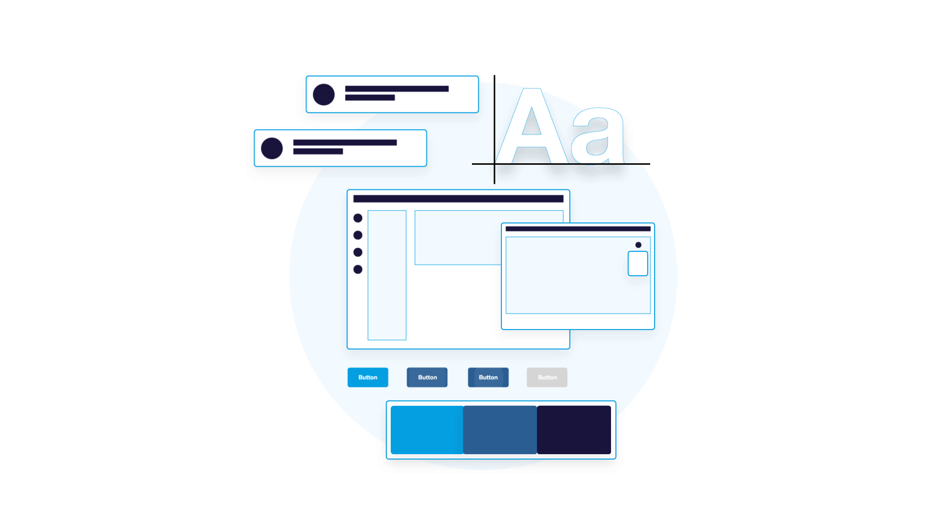
The New Experience
Based on feedback from the Support team, I redesigned a cluttered application page to surface critical information. I eliminated non-essential table grid columns, added key contextual details, and implemented targeted filters that empowered the team to swiftly isolate and act on priority cases, reducing time spent on manual review.
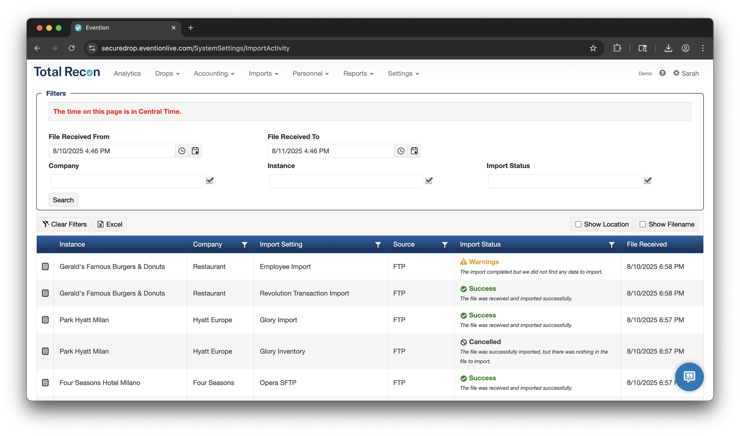
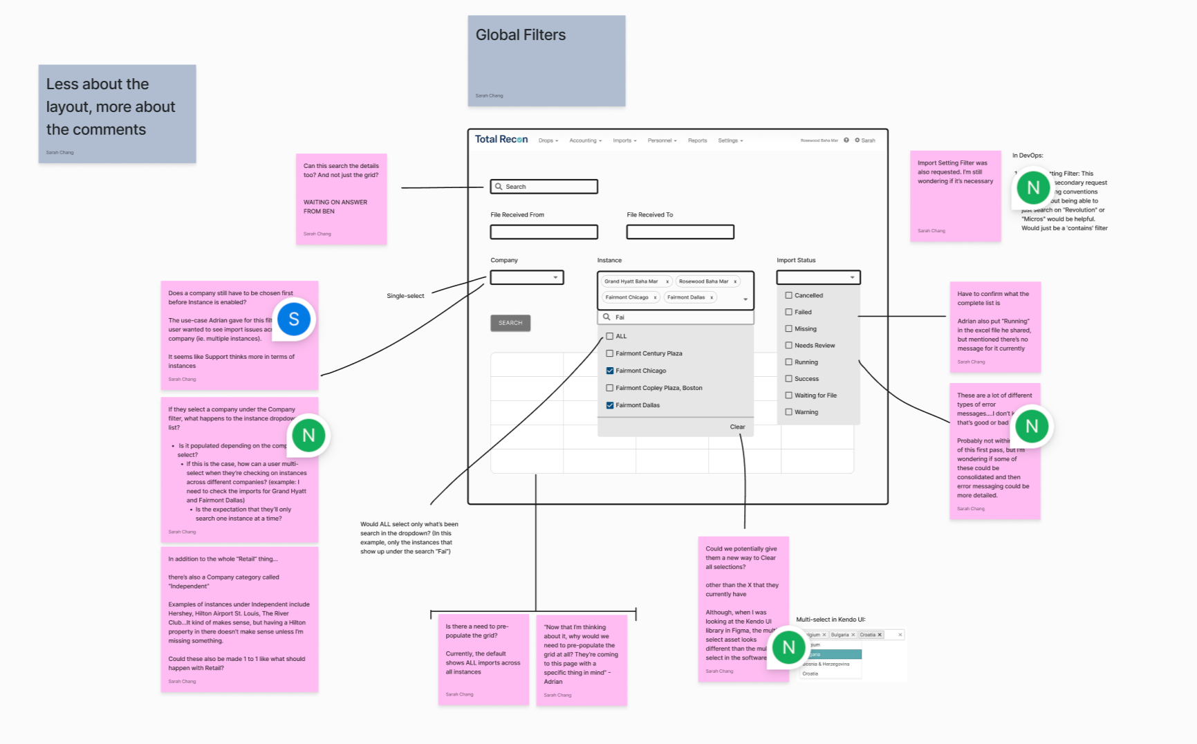
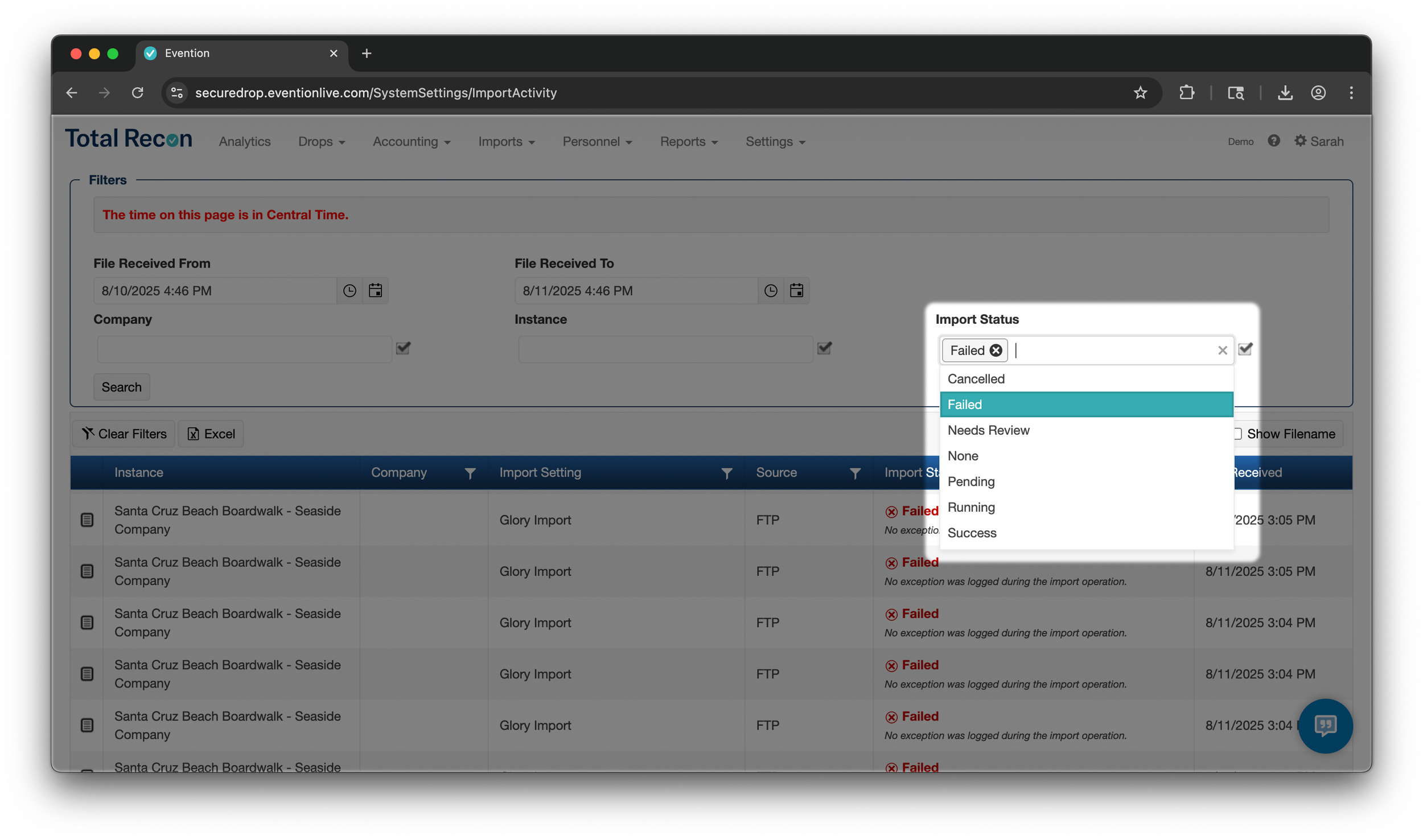
Streamlining their Triage
User interviews consistently highlighted the need for a more efficient triage process. Our internal team was spending valuable time manually sifting through low-priority cases. To address this, I designed new global filters that enabled users to quickly identify and prioritize clients requiring immediate attention, leading to a more focused and efficient workflow.
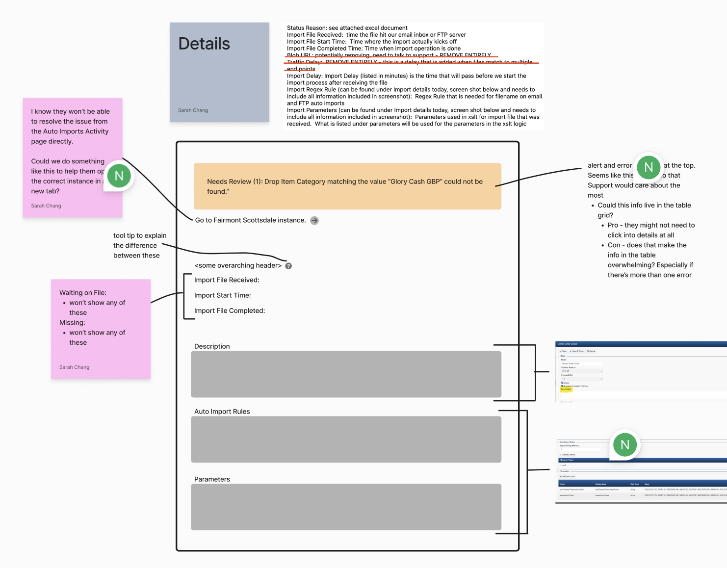
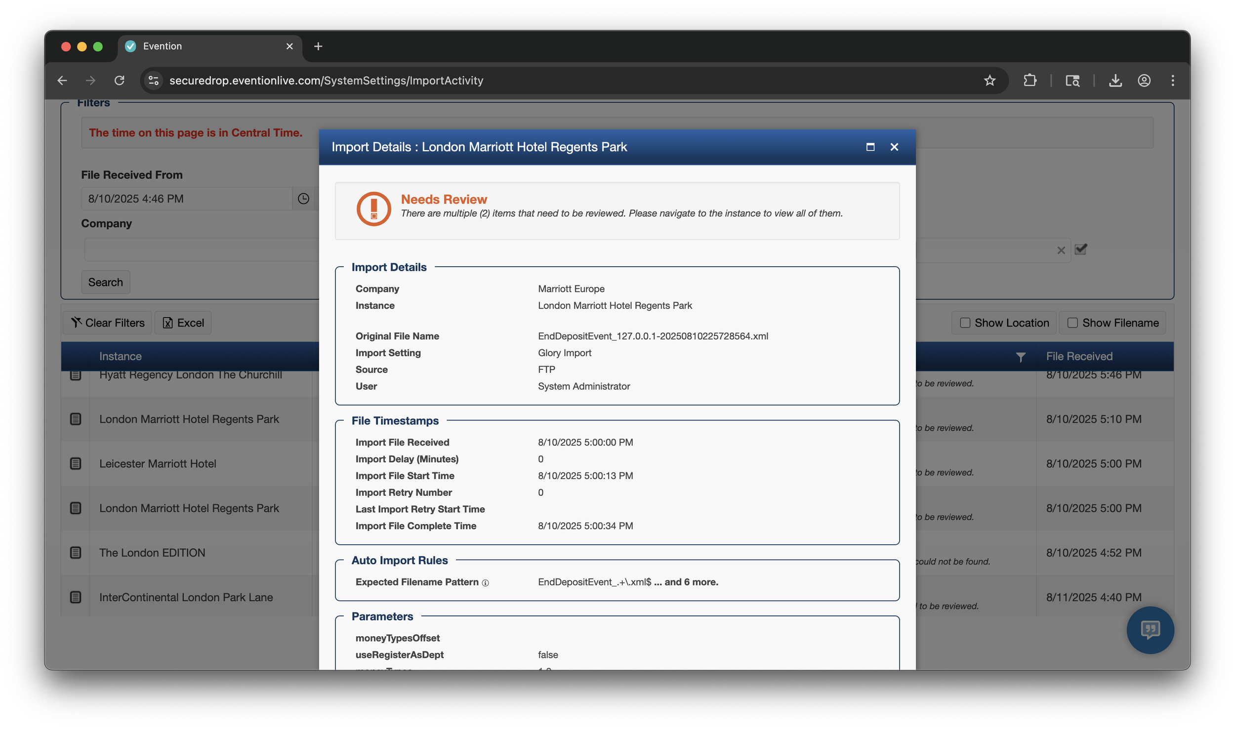
One Click for More Details
Instead of having to click into each client’s site, navigate to the correct pages, and investigate the issue, now internal users can see the snapshot diagnosis with one click. The details modal helps our Support team quickly identify the issue.
What previously took 20 minutes now takes 2 minutes, saving $165K annually!
We checked back in with our Support team after the page enhancements were developed and were glad to hear the improvements significantly cut down their mundane morning tasks. “This is 10 times easier,” one of the reps mentioned, “It makes everything so much easier instead of clicking through emails.”
With the substantial time savings, the company's annual cost associated with this process was reduced by an estimated $165,000. More strategically, the improved workflow enhanced the company's ability to service high-value customers, enabling the acquisition of more premier clients.