

MODERNIZING
the interface behind $4 billion in tip payouts
Evention's B2B tip payout software powers giants like Marriott and Chipotle.
We modernized their 2000s-era UX/UI to match their enterprise-level performance.
Diego is a restaurant manager.
He has just finished a busy Friday night, and now he has to figure out how to split the tips among his staff. That $20 tip on table 7 needs to be divided between the server, the bartender who crafted those fancy cocktails, and the busser who kept the tables clean.
Now multiply that by dozens of employees and hundreds of transactions every shift. Suddenly, that simple tip is a massive headache for Diego.

That’s where Evention comes in.
Evention’s Tips+Gratuities software simplifies even the most complex tip distributions for thousands of properties worldwide. That’s how the company has nabbed its major clients. In 2024 alone, our software was used to ensure $4 billion went to the right hardworking people who earned those tips.

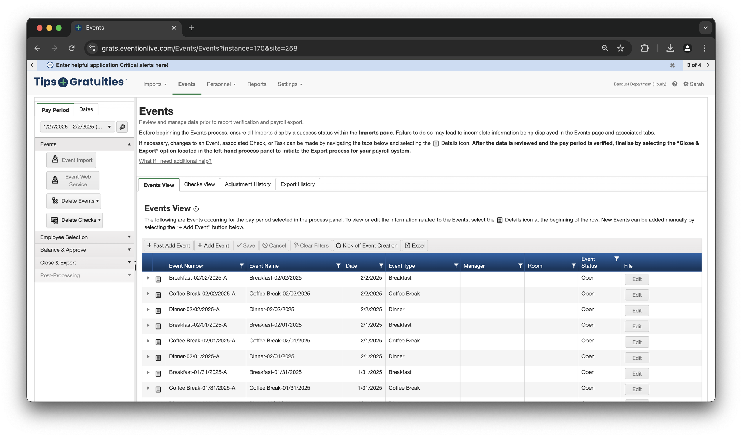
The Problem?
The outdated UX/UI of Evention's tip management system causes significant user frustration and creates a complex, unsustainable implementation process. Setting up new properties involves a tangled web of various interconnected settings and unique client requirements, demanding resource-intensive white-glove service for every client.
One of our interns said it “looks like a Wikipedia page.”
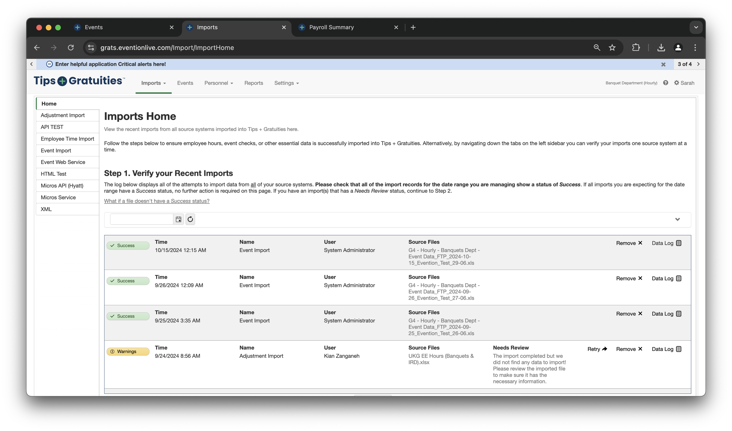
What should take 5 minutes was taking users an average of 59 minutes.
The “ideal” flow required users to switch pages 5 times. And that’s only if they knew what to do.

Before designing, we did a deep dive into all of our major competitors.
I’ve created several templates for our Design team, including competitor research templates. We analyzed our competitors’ interfaces, studied their demo videos to compare and contrast features, and assessed their overall threat level.
A new experience prompted a new interface, which meant we also needed to build up an entirely new Design System. To kickstart this process, our team leveraged Minimal UI as a base. As a result, we were able to rapidly mock wireframes.
We conducted several rounds of internal and external feedback sessions to get as close as possible to a design that helps our users complete their job efficiently.
Wireframe, feedback, iterate, repeat.

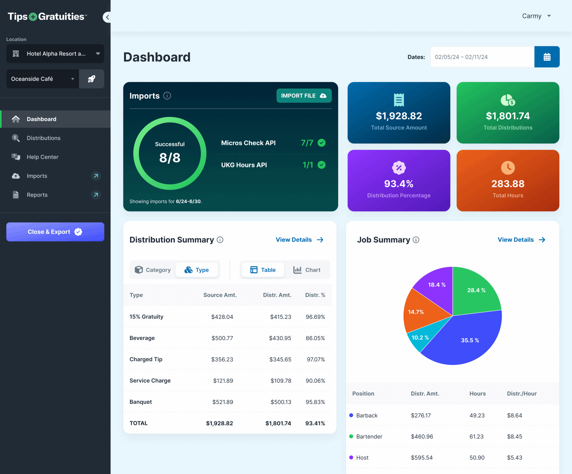
The New Experience
The new Dashboard experience gives users a high level summary of the most important information necessary to closing a pay period and ensuring accurate tip payouts to employees.
No more clunky user flows and an unintuitive UI!

No more page hopping. Everything the user needs is on one page.
The old experience required users to hop from page to page to accomplish their job, putting the ownness on them to know how to navigate the application. Our new experience bubbles up the important stuff, allowing users to review everything they need at a glance on one, easy to follow dashboard.
Each interaction has a purpose.
The old interface lacked intentional interaction design. Users would often click on buttons only for their screen to look the same. There were limited visual cues that they’d actually completed or initiated an action, which led to confusion and a lack of trust in the application. In the new experience, it was important for us to gain that trust back, so we made sure each click prompted a visual change.
Building for accessibility and responsiveness
The old interface laughed at accessibility and responsiveness. You want easy to read text? HA. You want to close payroll from your tablet because you’re a busy restaurant manager on the go? HA.
Well, good news for our users! Our Design team, along with Development, ensured our application was accessible and responsive across all devices.
Who says exporting payroll has to be boring?
My animations haven’t been prioritized YET, but I will not stop bothering Product until they get this on the development board. These hospitality professionals see spinning loaders of death far too often.
During a round of research, a user exasperatedly said to me, “I’d rather be watching Sunday football than doing this stuff, ya know?” With the new experience, users don’t have to waste their time on the mundane task of reviewing payroll any longer than they need to. The less time they need to spend in our application, the better—and that’s exactly what we started to see!
Users now complete their job in as fast as 2 minutes!

